Homestuck Art Discussion
Homestuck Art Discussion
So, you might not know this but Homestuck is, in fact a comic. A comic with visuals, and some very good ones on occasion. So if you've like this self important prick to analyse the composition, colour choices and everything else about your favourite panels, want to post about them yourself or just post some pretty-ass pictures, this is the place!
Re: Homestuck Art Discussion
If you don't mind analyzing a panel or two, I'd love to see what you say about my favorite one
https://www.homestuck.com/story/2192
I don't imagine there's a ton to unpack, but let's hear it
https://www.homestuck.com/story/2192
I don't imagine there's a ton to unpack, but let's hear it
Re: Homestuck Art Discussion
Ah, excellent choice. There is a fair bit here, largely in the line of action and colour selection. Making use of analogous colour harmony between purple and red is very common, but Hussie manages to avoid the monotony that comes with it's overuse through the pulsing dull red light, and breaking up the purple background with various sharp shades, veering even into black at points.Razzykins wrote: ↑Tue Dec 10, 2019 1:56 amIf you don't mind analyzing a panel or two, I'd love to see what you say about my favorite one
https://www.homestuck.com/story/2192
I don't imagine there's a ton to unpack, but let's hear it
As for Aradia herself, the gesture is extremely strong, with her body making up a single long and dramatically twisted line of action atypical of human figures. Fitting given she's not exactly something that could be described as "human" or even "alive" at this point in the story. Same with her hair, floating and contorting in ways that defy gravity. Poor, dead wee lass.
- MorganMustDie
- Posts: 556
- Joined: Sat Nov 16, 2019 5:26 pm
- Pronouns: f
Re: Homestuck Art Discussion
Not much to say here on my end, honestly. Green, blue and white simply go well together and on a technical level the image incorporates a large amount disparate techniques that blend together really well (which Homestuck's standard when it's art is at it's best it seems). The distortion attracts your attention to his "face" without being obnoxious, Typheus commands attention and respect and that's really fitting.MorganMustDie wrote: ↑Tue Dec 10, 2019 2:33 am-big ass image snip-
why tf typheus look so DAMN COOL
Also, fun denizen/Greek myth fact while I'm here, Typheus is said in the writings of Hesiod to be the child of Gaia and Tartarus, so effectively Earth and the Underworld, and is given the title of Father of Monsters. Another source, however, claims a far less impressive parentage... the youngest of the Titans, Cronus.

- calamityCons
- Posts: 894
- Joined: Sun Nov 10, 2019 9:25 pm
- Pronouns: they/he
- Classpect: Prince of Doom
- Moon: Derse
- Contact:
Re: Homestuck Art Discussion
I want to talk about the homestuck art style shifts and why they arent really a source of complaint in its original run but other things such as pesterquest or steven universe (which has confirmed homestucks on its creative team) having inconsistent art is not as acceptable.
I think the reason for this is context and the underlying consistency of homestuck’s utilization of art styles. What I mean by this is that moments that are Not As Momentous or Lower in Intensity are done with the simplistic and extremely consistent use of sprite art. The sprite proportions are chibi and missing arms until they are needed for a specific motion. They are primarily stmbolic and meant to indicate something that is more static and less intense.
On the other hand, whenever a character enters Hero Mode (the old school term for when the characters were fully illustrated) were for moments of intensity. Atomik Ebonpyre I think was the first time that a character (Dave) had more intense, but still stylized and abbreviated, illustrations to them. Dave wielding his sword and activating his timetables was extremely cool as well as indicating something has changed significantly about him.
This pattern remains throughout all future flashes and story moments. Descend and Make Her Pay featured a lot of hero mode characters because the moments in question were brutal, intense, and IMPORTANT. Make Her Pay especially had an animation bump with Terezi’s walking outside, and it illustrates what I’m talking about really well. The first section of it is almost entirely illustrations, made to show this moment is absolutely essential to pay attention to. Then, after Terezi loses her sight, it transitions to the SPRITE ART, indicating less important but still notable things that need to be seen, illustrating the trolls’ session in a bit more detail. When we return to the second part that is super duper important and essential to remember, Aradia beating up Vriska, returns to full illustrations because that moment is about Vriska finally paying for her excessive retaliatory behavior and Aradia getting closure for being killed by her own boyfriend through Vriska’s hand.
It’s pretty damn cool ngl
- Radical Dude 42
- Posts: 50
- Joined: Sun Nov 10, 2019 8:36 pm
Re: Homestuck Art Discussion
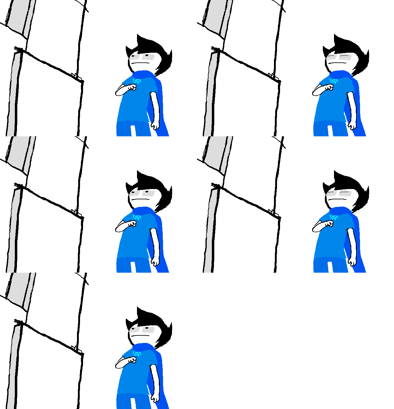
It's kind of a shame that the utilization of different art styles got kind of shunted in Act 6, though. For some reason they used the beany look for everything (which isn't even necessarily a bad look, it's just... it doesn't fit cool epic moments), which was just kind of disappointing. Especially because, at some points, the lineless bean style just kind of technically hurt the panels. Like when the white-clothed "white" kids were in white rooms. Like here:
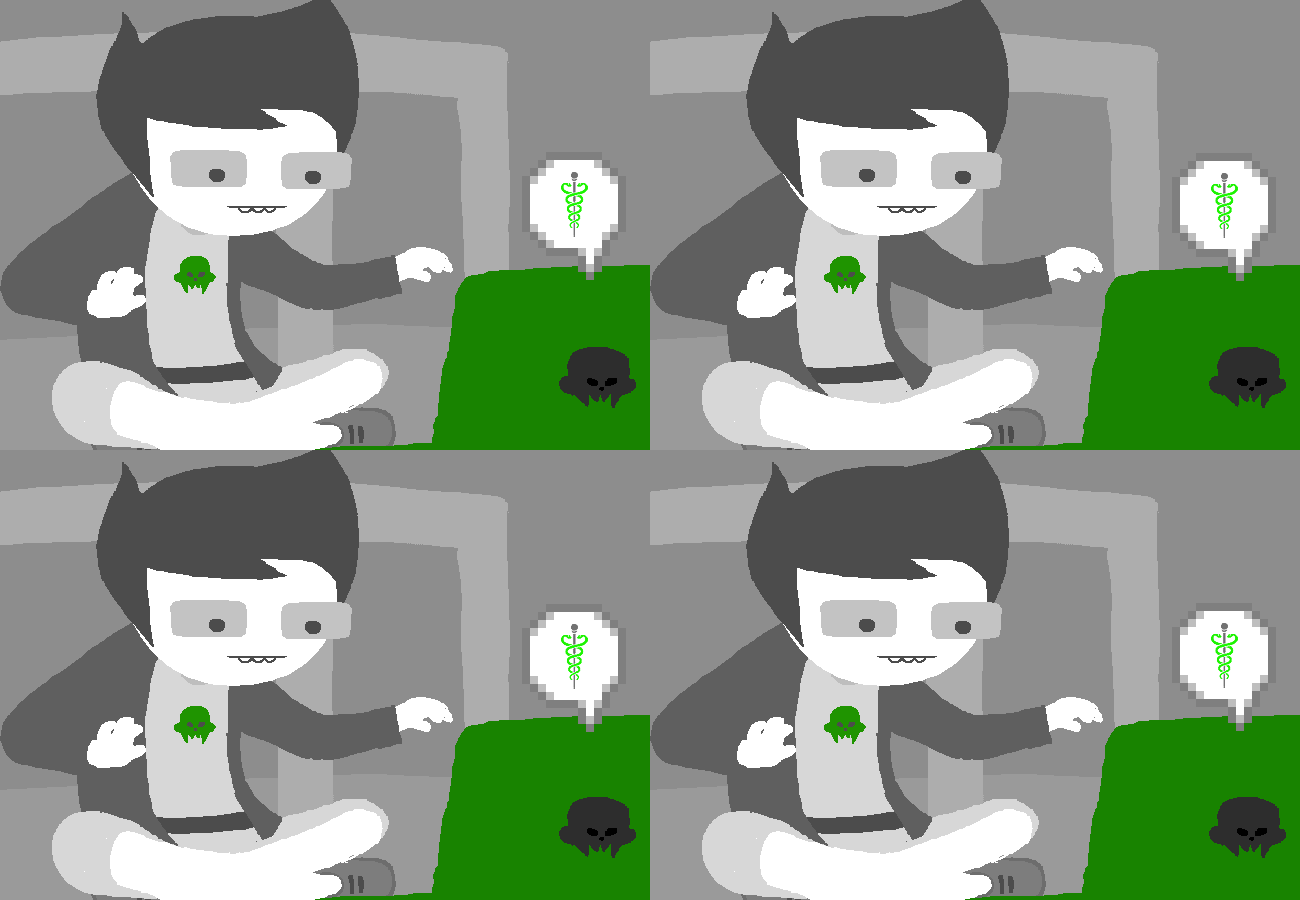 Now everything is just 50 shades of grey.
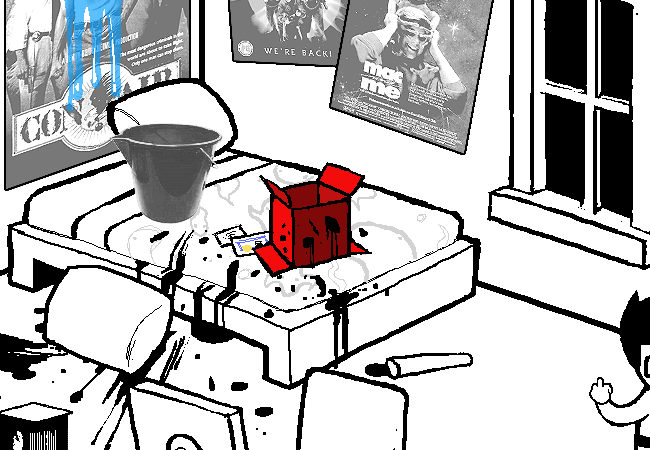
Though to humour Tarty's art analysis, I'd like to hear what's good about this panel. It's the panel that always comes to my mind when I think of "my favourite panel", so by that virtue, I guess it's my favourite panel.
Spoiler
Show

Though to humour Tarty's art analysis, I'd like to hear what's good about this panel. It's the panel that always comes to my mind when I think of "my favourite panel", so by that virtue, I guess it's my favourite panel.

- calamityCons
- Posts: 894
- Joined: Sun Nov 10, 2019 9:25 pm
- Pronouns: they/he
- Classpect: Prince of Doom
- Moon: Derse
- Contact:
Re: Homestuck Art Discussion
The looser bean style was difficult to deal with because for some reason act 6 refused to use linework despite linework being used tons of times previously in homestuck panels. But you’re right that the white-on-white scenarios were difficult to parse without using various shades of gray
- TH4NK YOU B3N
- Posts: 302
- Joined: Sun Nov 17, 2019 10:36 am
- Location: shorten my name as tyb3n
- Pronouns: he/him
- Classpect: Mage of Heart
- Moon: Prospit
Re: Homestuck Art Discussion
I guess it's because it'd be weird to put lines on an image that originally didn't have lines? Ehhh, I'm not sure why there was a need to use that callback in particular. I guess it shows that Jake English is like John, but emotionless and dumber? I'm struggling with this.
I'm trying to find a panel to comment on. I think weird how Dave's glasses in hero mode often look more like an extraterrestrial's eyes than Stiller shades, but here's a panel that doesn't have any of that.
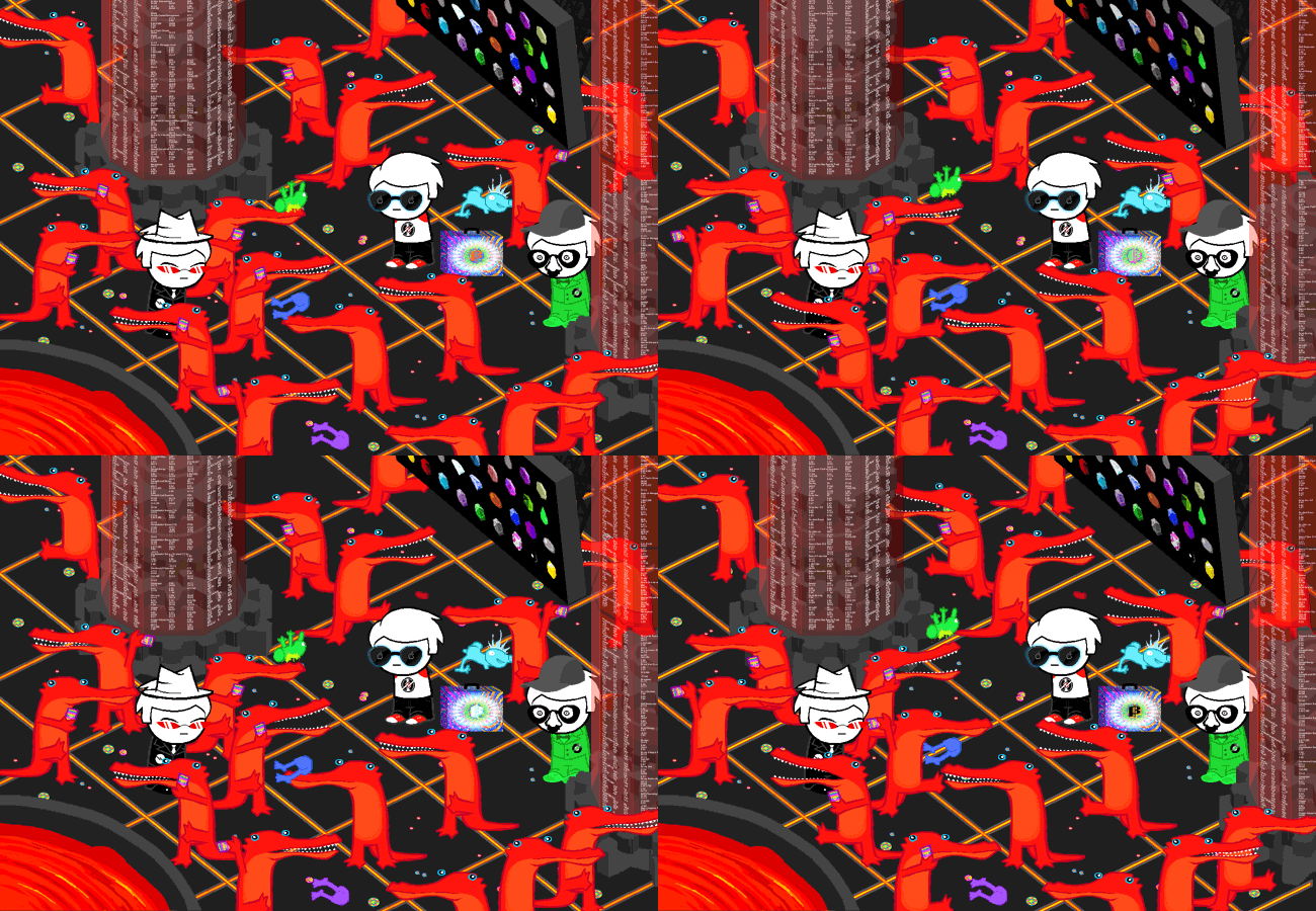
Do you see those crocodiles bouncing those Smuppet pieces? Daves using hats and glasses to differentiate themselves? Dave's really into them incremental games i guess.
I'm trying to find a panel to comment on. I think weird how Dave's glasses in hero mode often look more like an extraterrestrial's eyes than Stiller shades, but here's a panel that doesn't have any of that.

Do you see those crocodiles bouncing those Smuppet pieces? Daves using hats and glasses to differentiate themselves? Dave's really into them incremental games i guess.
only bad takes here
- Radical Dude 42
- Posts: 50
- Joined: Sun Nov 10, 2019 8:36 pm
Re: Homestuck Art Discussion
Oh god, I completely forgot that the Jake panel was a callback. I guess that... KIND OF makes it okay? Well, it's not entirely excused in my book. Especially because it doesn't seem to have any meaning, it just seems to be a pose-reusing deal. Also it's a damn shame that A6 refused lines, because it's not like Andrew physically COULDN'T do them anymore or anything. Like there's these panels (which may be some of the only lined (new) panels in A6? There's a couple of callback panels, but those are different) from one of the Homosuck intermissions.
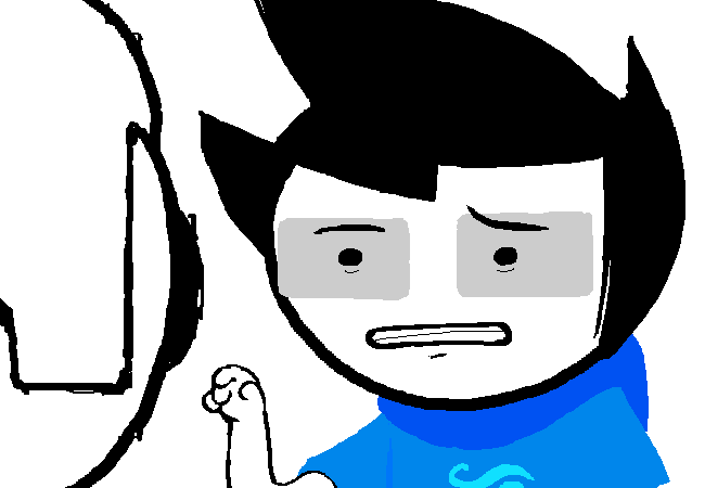
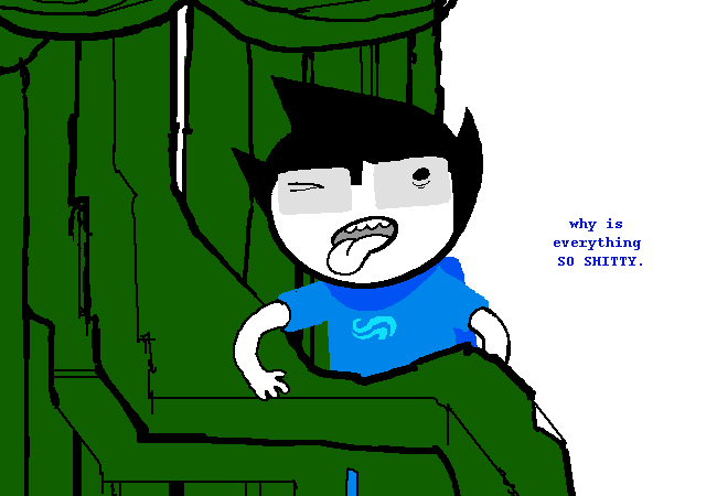
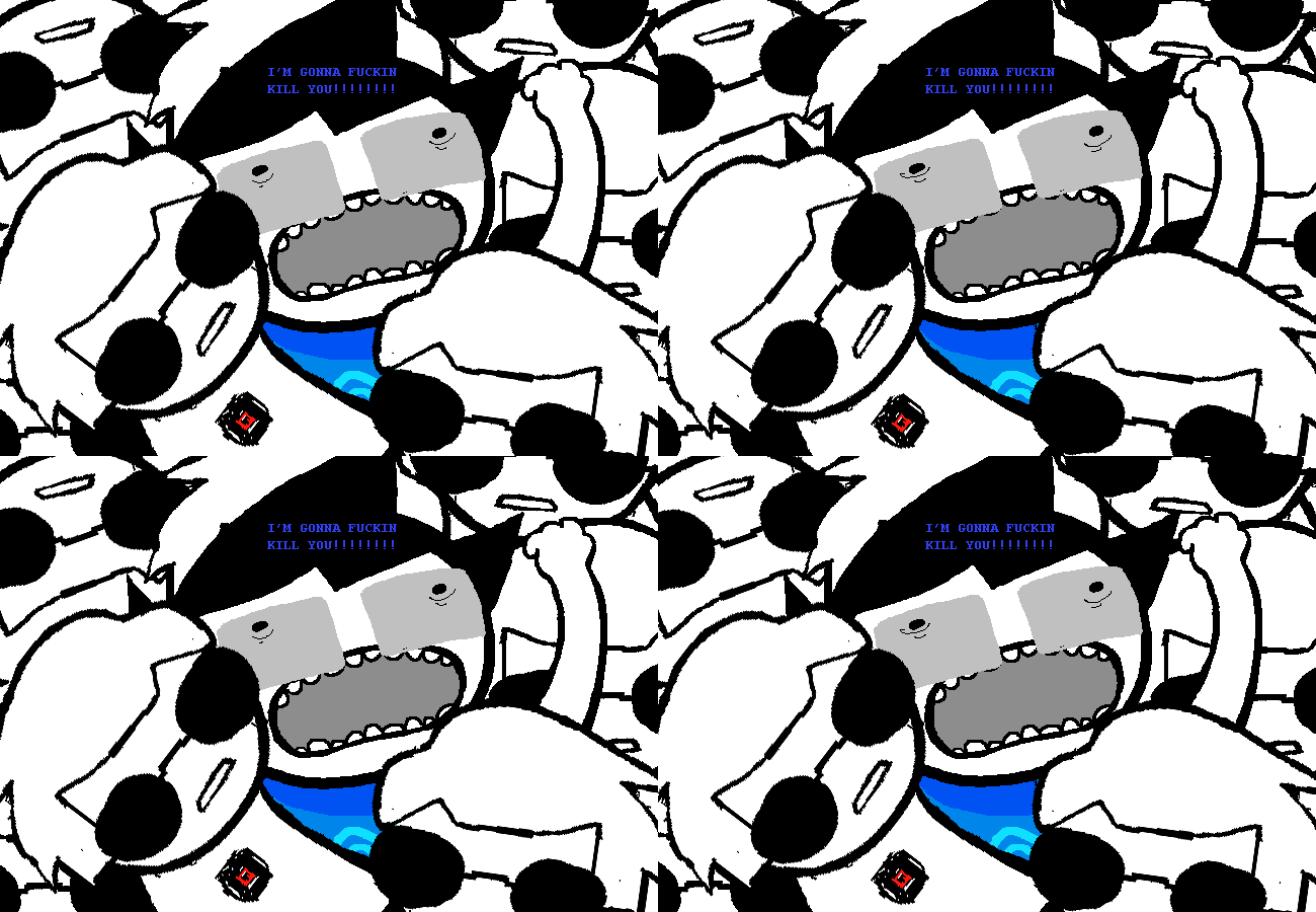 It really shows the bare minimum of art-style-adaption (white-skinned character with coloured clothes stands in white void, but it would be stupid to make him grey ==> give him outlines instead), but even the hint of that is... so much better than only sticking to one style, even if it is entirely unfitting.
Also oh yeah, Dave's specs did look a little alien at times. Chalk it up to ditching the bridge because of style (a classic Homestuck tradition: look at John or that one Jade showered in green light from... some flash. May have been WV: Ascend or whatever) and warping the lenses to make 'em look cooler and edgier. I've always found it a bit weird not because it looked alien, but because it's just kind of disingenuous to how Ben Stiller's shades looked. They were distinctly aviator-shaped. You know, it's actually kind of funny how Dave's glasses are like the one thing we 100% know the look of, because they're from real life.
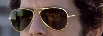 I wonder how much Dave fan-art actually has the gold rims.
Spoiler
Show


Also oh yeah, Dave's specs did look a little alien at times. Chalk it up to ditching the bridge because of style (a classic Homestuck tradition: look at John or that one Jade showered in green light from... some flash. May have been WV: Ascend or whatever) and warping the lenses to make 'em look cooler and edgier. I've always found it a bit weird not because it looked alien, but because it's just kind of disingenuous to how Ben Stiller's shades looked. They were distinctly aviator-shaped. You know, it's actually kind of funny how Dave's glasses are like the one thing we 100% know the look of, because they're from real life.
Spoiler
Show

-
Darth_Energon
- Posts: 219
- Joined: Sun Nov 10, 2019 7:12 pm
Re: Homestuck Art Discussion
John's glasses going full gray squares with dots instead of actual fucking glasses annoy the shit out of me

- Radical Dude 42
- Posts: 50
- Joined: Sun Nov 10, 2019 8:36 pm
Re: Homestuck Art Discussion
Hehe! *I* did those images! Honestly I don't think his glasses going lineless is that bad, but I do get similarly peeved when they flip his bangs around (as seen on Act 6 John there). Recently they did that for Jake, in HS^2, and I don't even really see HOW they could make that mistake, because it works against the flow of his hair.
- TH4NK YOU B3N
- Posts: 302
- Joined: Sun Nov 17, 2019 10:36 am
- Location: shorten my name as tyb3n
- Pronouns: he/him
- Classpect: Mage of Heart
- Moon: Prospit
Re: Homestuck Art Discussion
I have a hard time remembering which direction John's bangs go in. I guess it makes a zigzag shape with the cowlick? Sprite flipping has never been all that consistent.
only bad takes here
- calamityCons
- Posts: 894
- Joined: Sun Nov 10, 2019 9:25 pm
- Pronouns: they/he
- Classpect: Prince of Doom
- Moon: Derse
- Contact:
Re: Homestuck Art Discussion
I always imagined John’s hair was like a Japanese or Korean boy’s straight hair sticking up directly and into a point, with a couple of stray hairs and bangs that curve into his forehead. But I always interpreted him as a Japanese kid anyway so I had a bias.
His glasses being gray rectangles didn’t even register to me as anything at all really. I didn’t even notice it until it was pointed out!
His glasses being gray rectangles didn’t even register to me as anything at all really. I didn’t even notice it until it was pointed out!
- pfeffer-29
- Posts: 152
- Joined: Sat Nov 16, 2019 9:38 am
- Location: the time vortex
- Pronouns: they/them
- Classpect: Heir of Mind
- Moon: Derse
Re: Homestuck Art Discussion
Oh god I can't unsee it. His rectangular eyeballs stare emptily into the void.
I thought John's hair was the of the inexplicable Goku-spikes variety. Perhaps the flipping is just a property of its eldritch anime absurdity.
I thought John's hair was the of the inexplicable Goku-spikes variety. Perhaps the flipping is just a property of its eldritch anime absurdity.
you can pry karezi out of my cold dead hands
Re: Homestuck Art Discussion
Jesus Christ dude, spoiler that smut! The oil, the slicked up steel, the crumpled bedsheets... Sorry, lost my train of thought there.
- calamityCons
- Posts: 894
- Joined: Sun Nov 10, 2019 9:25 pm
- Pronouns: they/he
- Classpect: Prince of Doom
- Moon: Derse
- Contact:
Re: Homestuck Art Discussion
Tarty those sheets arent even crumpled lol
Re: Homestuck Art Discussion
The erotic theatre of the mind cares not for your petty notions of "reality".
- TH4NK YOU B3N
- Posts: 302
- Joined: Sun Nov 17, 2019 10:36 am
- Location: shorten my name as tyb3n
- Pronouns: he/him
- Classpect: Mage of Heart
- Moon: Prospit
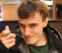 Perfection.